
00060-画直方图-windows10
前言
介绍如何画直方图。
官方教程地址: https://matplotlib.org/stable/gallery/statistics/hist.html .
操作系统:Windows 10 专业版
参考文档
Histograms
How to plot histograms with Matplotlib.
1 | import matplotlib.pyplot as plt |
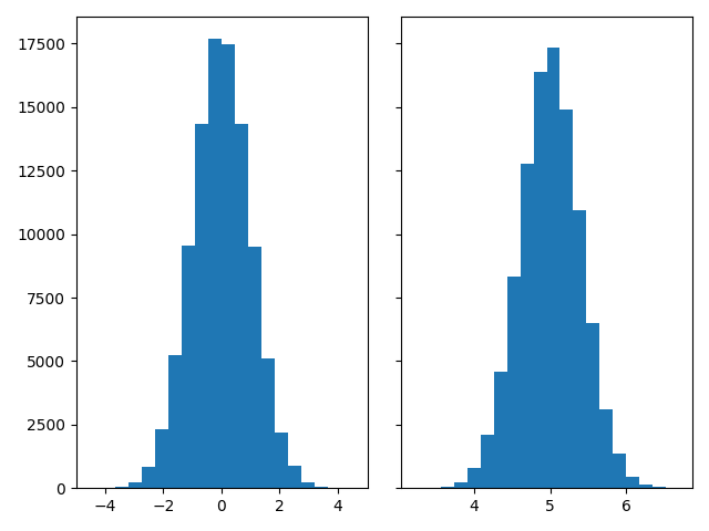
Generate data and plot a simple histogram
To generate a 1D histogram we only need a single vector of numbers. For a 2D histogram we’ll need a second vector. We’ll generate both below, and show the histogram for each vector.
1 | N_points = 100000 |
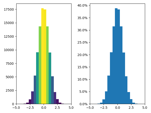
Updating histogram colors
The histogram method returns (among other things) a patches object. This gives us access to the properties of the objects drawn. Using this, we can edit the histogram to our liking. Let’s change the color of each bar based on its y value.
1 | fig, axs = plt.subplots(1, 2, tight_layout=True) |
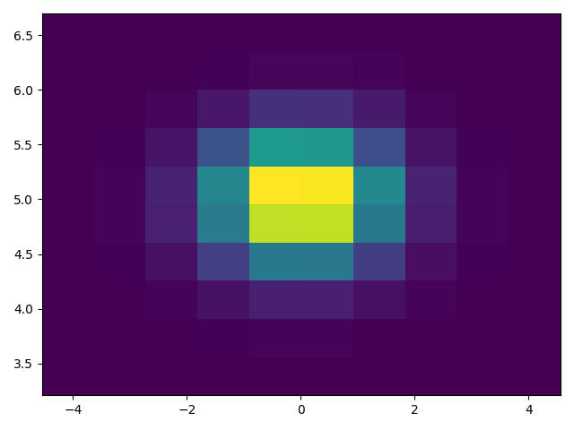
Plot a 2D histogram
To plot a 2D histogram, one only needs two vectors of the same length, corresponding to each axis of the histogram.
1 | fig, ax = plt.subplots(tight_layout=True) |
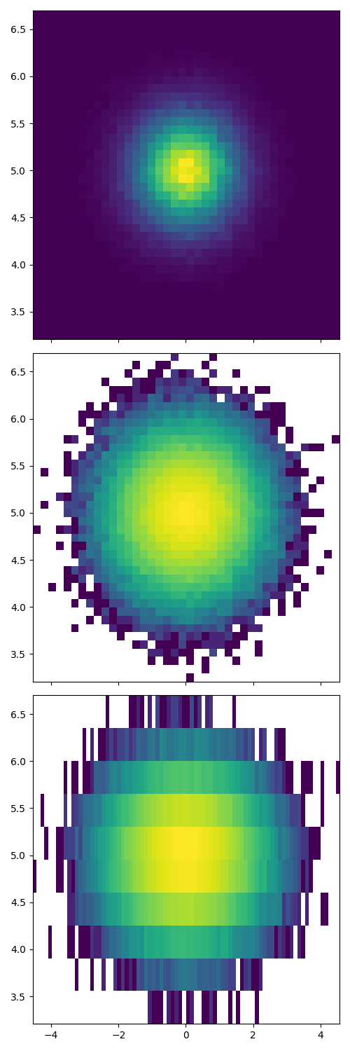
Customizing your histogram
Customizing a 2D histogram is similar to the 1D case, you can control visual components such as the bin size or color normalization.
1 | fig, axs = plt.subplots(3, 1, figsize=(5, 15), sharex=True, sharey=True, |
References
The use of the following functions, methods, classes and modules is shown in this example:
结语
第六十篇博文写完,开心!!!!
今天,也是充满希望的一天。
 wechat
 alipay